The Upside Down Homepage Concept
I was introduced to a really helpful branding concept recently–the Upside Down Homepage. The idea here is to take the traditional homepage design, which consists of things like a welcome message, a brief description of the site, compelling reasons to visit the site, a navigation header menu, and hopefully an opt-in offer, and turn it upside down. An important and proven means of audience building is email list building. Yes social is very important, but our email subscriber base is arguably a brand’s best friend. Here’s the thing about the upside down homepage layout. It puts the opt-in offer front and center, truly flipping the traditional homepage design on it’s head.
I first heard about this concept from Pat Flynn of The Smart Passive Income blog fame and Bryan Harris from Videofruit, who recently hosted a webinar titled “3 Strategies You Can Use to Rapidly Grow Your List in the Next 7 Days.” During the webinar, Pat and Bryan sited the homepage of blogger, author, speaker Michael Hyatt. They went on to say that opt-in rates increase dramatically when optimizing a homepage, including using this upside-down approach. If my notes are correct, there have been case studies showing opt-in increases of 200-300%. That’s huge!
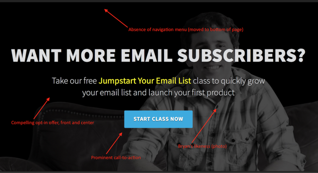
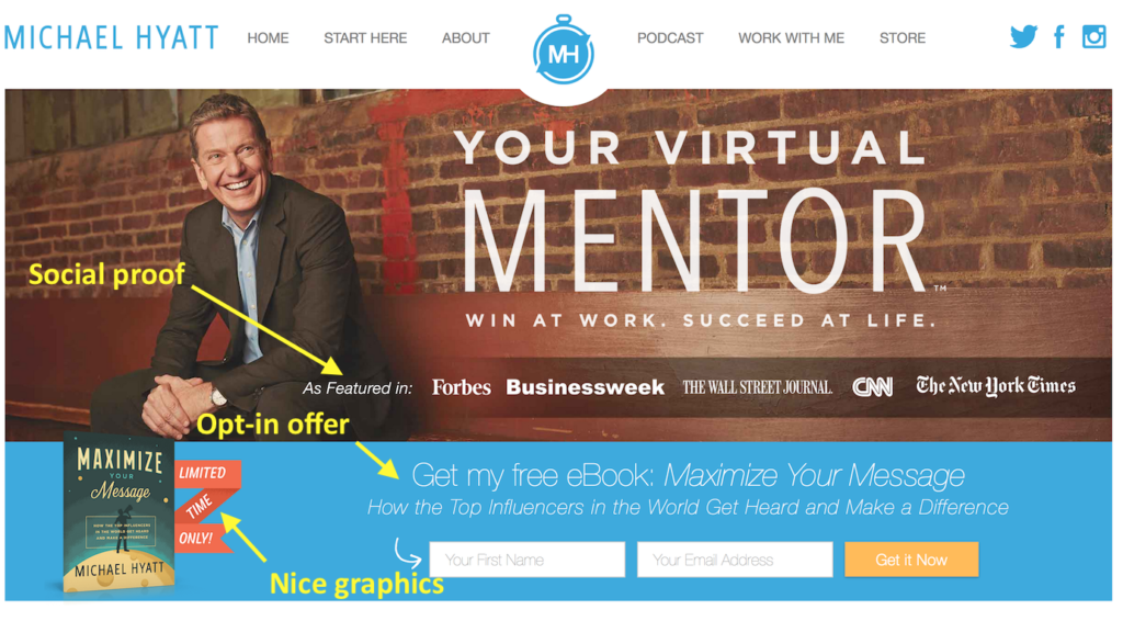
The point of this approach, as I understand it, is to encourage site visitors to subscribe, rather than navigate to other pages. Michael Hyatt’s homepage is a good example of placing a value based opt-in offer front and center, but Bryan Harris’ Videofruit homepage layout goes all the way. Allow me to compare these two homepages, both of which are compelling.
Videofruit
- Navigation menu has been moved to the homepage footer
- Compelling opt-in offer is placed front and center
- Great photo of Bryan
- Prominent call-to-action

Michael Hyatt
- Compelling opt-in offer is placed front and center
- Great photo of Michael
- Prominent call-to-action
- Social proof located above the fold

Both homepages are pretty amazing. Bryan Harris at Videofruit definitely went all the way. His homepage has it all, from a compelling opt-in offer to the limited distraction approach of moving his navigation to the bottom of the page. The top line of text is an important question that speaks to the pain that many of us experience–we want more subscribers. Then highlighted is what we’re looking for, the answer to our problem in four words–Jumpstart Your Email List!
While Michael Hyatt’s page leaves the navigation menu at the top of the page, I have to give him bonus points on two fronts. One–there’s no text immediately near nor on his face. Two–all the goods are above the fold! This is the best part of Michael’s page in my opinion. All the important stuff is visible without having to scroll down. I can see his offer, call-to-action, profile photo and social proof; all without scrolling. Low and behold, Micheal and his team are directly responsible for the WordPress theme that powers his website. He calls it The Get Noticed! Theme for WordPress. A little pricey, but pretty dang impressive. Yup, I said “dang impressive.”
I’m in the early stages of creating an online business with a big idea to help musicians be better marketers, and my website is poised for a homepage redesign. In fact, the website you’re reading from now, is pretty new and also a perfect candidate for the upside-down concept and approach. The upside-down approach is one of many excellent list building tactics to which I’ve recently been introduced. Here are some other noteworthy recommendations.
These first few are from the Bryan Harris / Pat Flynn webinar.
Pick your list goal
How many subscribers are you after (100, 1000, 10k)? A goal will help you determine what tactics will work best for you, and will help you more quickly reach that goal. If you want 100 subscribers, direct outreach might trump redesigning your homepage, for example. Maybe.
Invite one person to join your list
Here’s a nice example that Bryan and Pat gave.
Hey Roger! I’m starting a weekly newsletter where I send out [gardening and lawn care tips]. Thought you might dig it. Want in?
During the webinar, I made a note to myself that a text or IM to my personal contacts would work for this approach, and it’s an extended reach. There are so many friends and contacts that I have mobile numbers for and with whom I’m connected on Facebook or Twitter, so why not use those channels to extend the invitation. In some cases, it may even make more sense for me to use those channels in lieu of email, remembering that my ultimate goal is to get an email address. An important thing to consider here is that my friends and family will want to connect me with my audience, and so will yours. In the example of the marketing platform musicians that I’m currently working on, there’s no good reason to focus only on musicians. My friends and family know musicians that I don’t know. Are you following me?
The poster boy (or poster girl) formula
I really like this one! Check it out.
- Make a list of 5 products you’ve purchased, 5 blogs you read, and 5 podcasts you listen to
- Tell the owner of each one big win you’ve experienced from their teaching
- Ask for nothing in return
You can try this with as few as three people, if you can’t think of five. Share your win and a relationship will likely ensue. This should go without saying, but be genuine, be genuine, be genuine and oh yeah–be genuine. I’m told that content creators love this. I know I do. Your win story doesn’t have to be something big, but I imagine that big has more potential to get noticed.
Nathan Barry of ConvertKit offers one more great tip. Actually, he has many to offer, but this one is about getting your first 100 subscribers, and creating a list of blog topics in the process.
- Write down 10 names from your target audience
- Email them with… “I’m starting a site on [topic]. Would you be interested?”
- Ask these two questions:


Leave a Reply